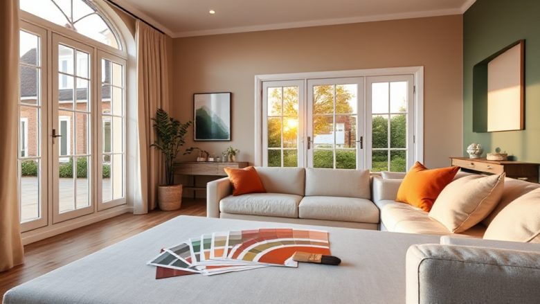
Paint is the cheapest way to change a room and the easiest thing to get wrong. You spend a weekend on it, live with the result for years, and every time you walk past that wall you either feel settled or slightly annoyed. No wonder so many people freeze at the colour card. The trick is to stop treating it as a taste question and start treating it as a process. If you want to know how to choose a colour scheme for your home without second-guessing yourself for months, work through the steps below in order. Each one narrows the field, so by the time you buy a tin you already know it will work.
Start by assessing the light in each room
Light decides what a colour actually looks like on your wall, and it matters far more than the paint chip does. A soft grey that looks calm in a north-facing bedroom can turn cold and slightly blue by mid-afternoon. The same grey in a south-facing kitchen may read warm and almost greige. Before you look at a single swatch, spend a day noticing how light moves through the space.
Which way do the main windows face? North-facing rooms get cool, indirect light for most of the day, so they tend to make cool colours feel colder and can drain the life out of pale greys. South-facing rooms get warm light most of the day and can carry cooler tones beautifully. East-facing rooms are bright and slightly blue in the morning, then dimmer later. West-facing rooms are darker in the morning and glow warm in the late afternoon and evening, which can make warm colours feel almost golden.
Then look at what the light bounces off. Dark floors, heavy furniture and dense curtains swallow light and push a room toward its cooler side. Pale floors, mirrors and glossy surfaces throw it back. A room with one small window and dark wood everywhere will always feel heavier than the same paint in a bright, open space, so plan for that rather than fighting it.
Artificial light counts too. Warm white bulbs around 2700K flatter reds, yellows and earthy neutrals. Cool white bulbs around 4000K and above make blues and greys look cleaner but can turn warm colours muddy. If you have a mix, decide which one you actually use in the evening, because that is the version of the room you will see most often. Keep a note of the compass direction and the dominant light temperature for each room you plan to paint. You will use both constantly.
Choose a base neutral that suits the room
A base neutral is the colour that covers most of your walls. It sets the mood and gives every accent something to sit against, so it is worth getting right before you think about anything bolder. The word neutral is misleading, because there is no such thing as a colour with no temperature. Every off-white, grey, beige and taupe leans either warm or cool, and that lean is what you are really choosing.
Warm neutrals include cream, oatmeal, greige, sand and soft taupe. They contain a hint of yellow, red or brown and tend to make a room feel cosy and grounded. Cool neutrals include blue-grey, cool white, dove grey and pale stone. They contain a hint of blue, green or violet and tend to feel crisp and airy. Neither is better. The question is which one the room and its light can support.
Here is a simple rule that saves a lot of regret. If the room gets cool light, lean warm with the base. If it gets warm light, you have more freedom and can go either way, though a cool base will keep a sunny room from feeling overheated. If the room is small or dark, choose a base that is lighter than you think you need, because colour absorbs light while pale surfaces reflect it.
Match the base to the fixed elements you cannot easily change. Look at the undertone in your flooring, worktops, tiles and any exposed brick or stone. Oak floors usually pull warm, so a warm base sits naturally with them. Grey laminate or cool stone tiles pull cool, so a cool base looks more intentional. This is not about matching exactly. It is about making sure the base and the fixed finishes are not fighting each other across the temperature line.
One more thing: pick the base in the finish that suits the room. Matt hides imperfections and looks softer on walls. Eggshell and satin are easier to wipe, which makes them the practical choice for kitchens, hallways and anywhere children or pets pass through. The finish changes how light behaves on the surface, so a colour can look noticeably different in matt versus satin.
Pick accent colours with a clear job to do
Accents are where a scheme stops being safe and starts being yours. The mistake most people make is treating accents as decoration rather than structure. An accent should have a job: draw attention to a feature, define a zone, or add the contrast the base is missing. If you cannot say what an accent is doing, it is probably just noise.
A workable scheme usually has three parts. The base neutral covers roughly sixty per cent of the room. A secondary colour, often a deeper or lighter version of the base family, covers about thirty per cent and lives on larger pieces such as a sofa, curtains or a rug. The accent covers the last ten per cent and appears in small, deliberate doses: cushions, a lamp, a painted alcove, a single chair. That balance is why rooms with strong colour can still feel calm.
When choosing the accent, borrow from something already in the room rather than inventing from scratch. A colour in a favourite rug, a piece of art, a cushion you love or even a view through the window will sit more naturally than a random bold shade. Pulling an accent from an existing object also guarantees the scheme will not clash with it.
If you want contrast, go for a clear jump in depth rather than a small one. A mid-grey base with a slightly darker grey accent reads as an accident. The same base with a deep charcoal, navy or forest green accent reads as a decision. Small differences look like a mistake; big differences look like intent.
Test your accent against the base in the actual room before you commit to quantity. Some colours that look wonderful on a swatch become overwhelming across a whole wall, and others that seem dull in isolation come alive in small doses. If you are nervous, start with the accent in removable items such as cushions, throws and lampshades. You can always paint a wall later, once you have lived with the pairing for a few weeks.
Test samples in the room before you commit
This is the step people skip, and it is the step that prevents expensive mistakes. A paint chip under shop lighting tells you almost nothing about how a colour will behave in your home. Buy sample pots, paint large patches, and live with them for at least a few days.
Paint the samples directly onto the wall you plan to cover, not onto paper or card. Paper has its own colour and texture and will skew what you see. Make each patch at least A3 size, ideally bigger, because a small square surrounded by your existing wall colour will be influenced by it. Two coats, straight from the tin, with no white border left showing.
Put the patches in different spots: one near the window, one on the wall opposite, one in the corner that gets the least light. A colour that works in one position may fail in another, and the corner test is where cool greys and pale neutrals often reveal their true character. Look at the patches at several times of day, in morning light, in the afternoon and under your normal evening lamps. Take photos on your phone and compare them, because a camera flattens the difference between similar tones and can help you spot which one is genuinely warmer or cooler.
Once you have narrowed it down, buy a small tin and paint a full wall or a large board you can move around. This is the final check before you commit to the whole room. If a colour still pleases you after a week of ordinary life, it will almost certainly please you after a year. If you find yourself making excuses for it, that is your answer.
Apply the scheme room by room
A whole-house colour scheme sounds tidy, but rigid repetition rarely works, because rooms face different directions and serve different purposes. A better approach is to keep a consistent base family and let each room adjust within it. That gives the home a coherent feel without forcing every space into the same light.
Hallways and landings usually have little natural light, so keep them pale and warm to stop them feeling like tunnels. Living rooms can carry more depth, especially if they are used mostly in the evening, when a richer colour makes the space feel enveloping. Kitchens and bathrooms benefit from colours that handle steam and splashes, which usually means mid-tone or lighter shades in a wipeable finish. Bedrooms are the place to be gentle; soft, muted tones help the room settle at night.
Keep the base consistent across connected spaces so the eye flows from one room to the next. You can shift the accent from room to room, or use the same accent in different proportions. A deep green that appears as a painted alcove in the hall might become a whole wall in the study. The base holds the scheme together; the accents give each room its own character.
Work through the house in order of priority rather than all at once. Start with the room that bothers you most, get the base and accent right there, and use what you learn in the next space. Painting one room well teaches you more about your own taste than any amount of browsing ever will. And if you change your mind later, you are only repainting one room, not the whole house.
Frequently asked questions
How many colours should a room have?
Three is a reliable number: a base neutral, a secondary colour and an accent. You can add a fourth if it comes from the same family as one of the others, but beyond that a room tends to feel busy. The proportions matter more than the count, so keep the base dominant and let the accent stay small.
Should ceilings be white?
Not necessarily. A pure white ceiling can look stark against a warm wall, and it draws the eye upward. Tinting the ceiling with a very pale version of the wall colour, or using a soft off-white with the same undertone, usually looks calmer and makes the room feel more considered.
What if I choose a colour and hate it?
It happens, and it is fixable. Live with it for a week before reacting, because paint shifts as it dries and as the light changes. If it still feels wrong, adjust the accent rather than repainting everything, or add a large rug or artwork that changes how the wall reads. If the base itself is the problem, repaint it; a single room is a manageable correction, which is exactly why testing first is worth the effort.